Butchershop is abuzz for Design Week, as we plan epic events like a wine and font pairing, live wooden totem carving, a lunchtime seminar on pricing creativity, and our annual open house event, complete with piles of charcuterie. We’re especially excited to show off our brand new Vandercook 3, a one-ton 1950s letterpress that smells like ink, sweat, and whiskey.
We’re inviting folks to come in for a letterpress workshop and print their own unofficial SF Design Week poster on this behemoth machine—and we need your help to decide which poster design is Design Week worthy. Mostly so we can order the right plates and ink. But also because we value your esteemed opinion.
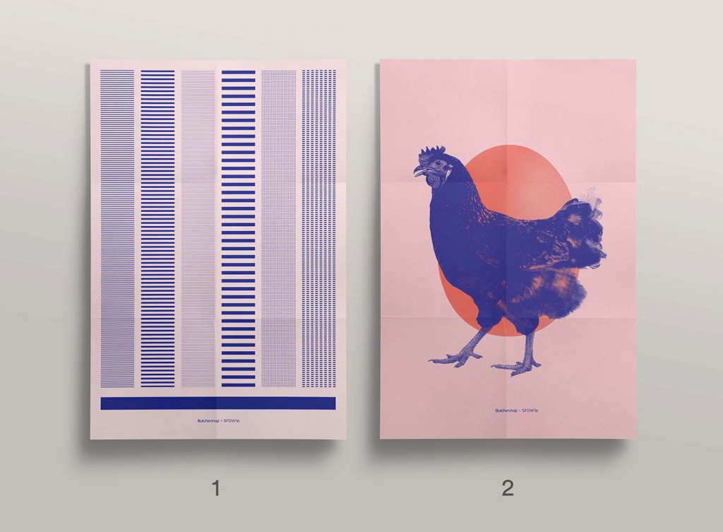
Our designers created some incredible posters, and after an internal vote, we’ve narrowed them down to two finalists:

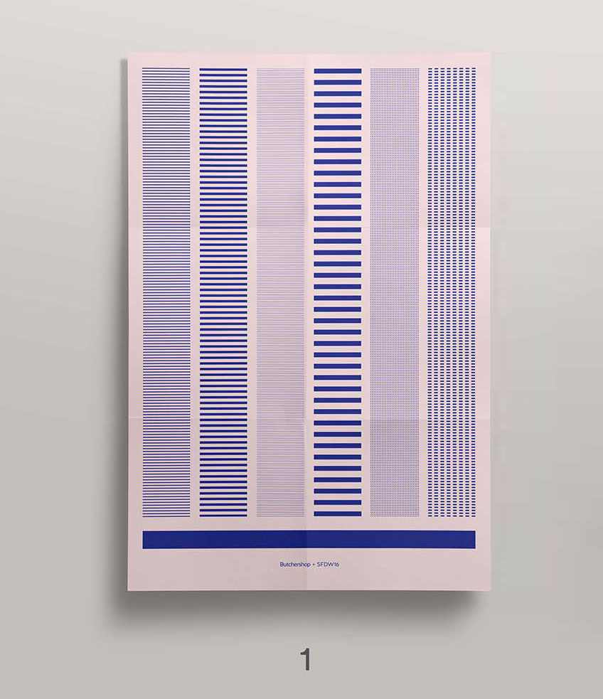
Poster 1: “Make Your Own Rules”
Designed by Lead Designer Brad J. Aldridge, this poster ponders the need for rules, and whether they help or harm the creative process. The poster is an art piece literally made up of hundreds of rules, lines, and dots. Bonus: If you blur your eyes and stare long enough, you can see a dinosaur. Or whatever.

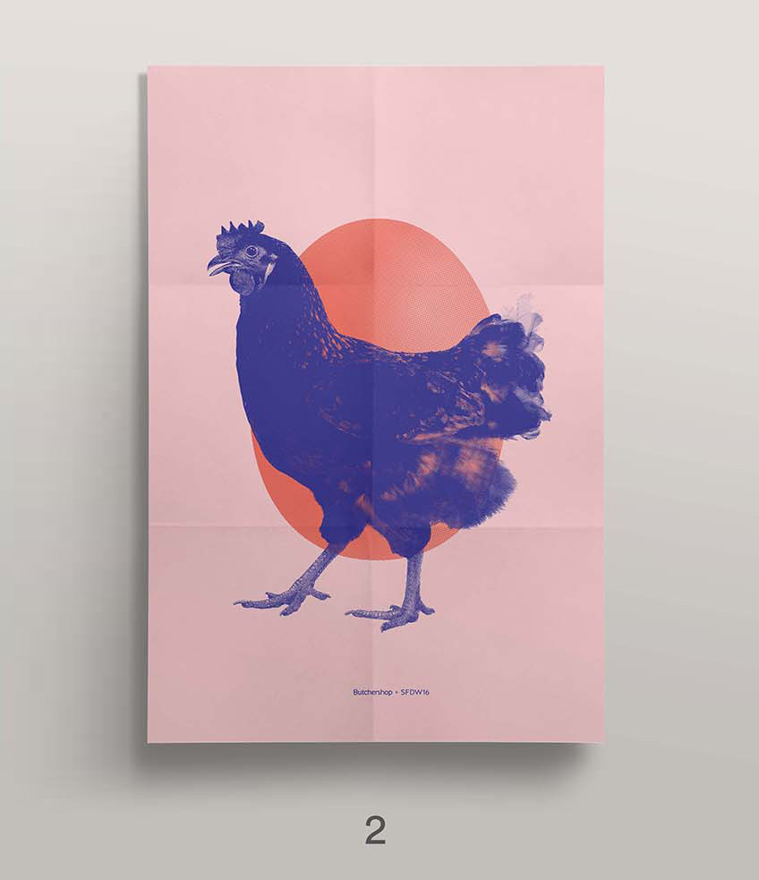
Poster 2: “Stop Asking Which Came First.”
Designed by Lead Designer Ryan Henbest, this poster takes a definitive stance on an age-old question. The poster comes pre-printed with the egg and guests will proudly close the loop with the chicken. It’s a metaphor for creatives to stop worrying about the right place to start. Just make a decision, stick with it, and move the project forward.


