

Sparxo, a well-designed, white labeled, event ticketing platform is no stranger to elegant design. Sparxo aims to differentiate itself in a competitive industry with great user experience and modern design practices. Every detail matters to deliver a great user experience. This is why a lot of thought goes into the simplest design projects.
A great example of this practice was in the resent design change to their digital tickets. Even though there are not that many requirements for a ticket, the redesign will be seen by hundreds of thousands of event ticket holders. A ticket is also the main touchpoint to the Sparxo platform. Getting this designed well is important to the brand and experience.
Gathering Feedback
The root of all good design is gathering user feedback. There was one large piece of data used to spark the need for redesigning the digital ticket. We noticed in customer site visits that for those who printed tickets to bring to an event, they were folded in ways that made it difficult to quickly find the QR code. This caused entry lines to slow down. Imagine 1000 people taking 10 seconds to find a QR code to show to the ticket scanner. That might not seem like a long time, but it adds up to over two and a half hours of time spent unfolding paper. We know that if we could shorten this time, we could improve the experience for both the patron and the ticket scanner.

Inspired without Copying
For all designers, there is a fine line between inspiration and copying another design. We walked this line carefully as we came up with our new ticket design. We knew we wanted to adopt a design used by a major airline that elegantly showed ticket holders how to fold their ticket so it was easy to store and show the ticket. We drew our design inspiration from all types of tickets but were particularly i nspired by one design. It’s great to be inspired from great designs to solve a problem that you have.
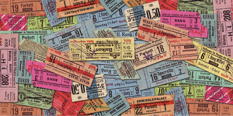
Tradition vs Innovative design
We all know what a ticket looks like. While our old design brought a since of familiarity, it was based off of a decades-old ticket design. As a small startup, this was an important design consideration to reassure ticket buyers they have received a legit ticket as the ticket industry is full of fraud. For the new design, we decided to take a new approach and change the design to a more modern layout improving usability but departing from the traditional design. This comes at a time where we think the typical consumer welcomes innovative design and can let old design paradigms go.
Using Design to Achieve Two Competing Goals
Sparxo stands out as a white labeled ticketing solution. With this in mind, white labeled or not, the Sparxo brand needs to be known as well. These two goals are in direct competition with each other. This is where we test the limits on what it means to be white labeled. Through customer feedback, as long as the Sparxo brand is not annoyingly in your face, presenting the Sparxo logo elegantly is acceptable. With careful design, we can achieve both goals.
Designing for Two Distinct User Groups
Even this small design project has two distinct user groups. One user group is the ticket holder and the other is person scanning tickets at the entrance of the event. We made sure that the design catered to both, giving the necessary information to each user group in a concise place. When the ticket is folded up, one side has all the information for the event goer the other, the ticket scanner. Keeping both user groups in mind influences better design.