Slack, email, the Web, Instagram, AR, VR, Holograms… Despite the onslaught of technology, there’s a reason branded environments like tradeshows are still relevant. As a species, we have a desire to be among other people, to communicate face to face. Telling stories around campfires is still a powerful part of our background. That’s why trade shows, innovation centers, and SF Design Week exists: to swap stories around a central organizing event, to see what our colleagues are up to, and share the best the design community has to offer.
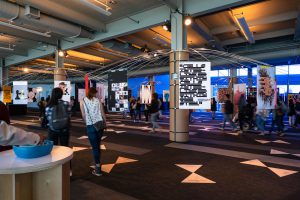
This year, more than 2,000 attendees swarmed into San Francisco’s Pier 27 to attend the opening night gala, hosted by AIGA SF. Inside the cavernous space, usually dedicated to embarking thousands of cruise ship passengers at a time, attendees took in and submitted bids on 100 posters on the theme of commUNITY donated for auction by artists from 17 countries. For Mitchell Mauk, founder of Mauk Design, the studio responsible for the poster exhibit design, the challenge was to display 100 posters in 54,000 square feet of open space that boasted floor to ceiling windows supported by two-story columns.

When it comes to exhibit design, Mauk says, “You think ‘walls’ but in the Pier 27 environment there were no walls. Ultimately the idea is to let these powerful posters lead us to the solution. By incorporating the columns in Pier 27 as a design feature we were able to pull this off in three weeks on a minimal budget.”
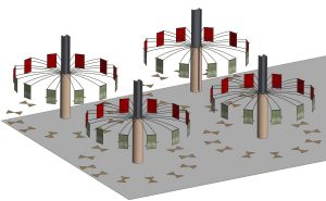
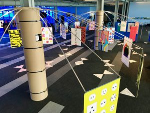
Mauk’s solution was to keep the exhibit as unobtrusive as possible by using the supporting columns to create “a pinwheel effect” using long aluminum rods to hang each poster and create a circular viewing space through which people could wander. “My inspiration came from looking at the poster competition website. There were remarkable, amazing ideas. As an exhibit designer you want the display to support the idea: make the posters the hero, not the display. You don’t want the display doing all the singing and dancing. The display should become invisible.”

It’s an elegant and cost-effective solution. “Once we encased the columns, then the columns do all the heavy lifting,” Mauk says. “The aluminum rods attached at the top of the columns provided a minimalist way to ship, and install in just eight hours. Column wraps were assembled with tie down straps from Home Depot. The fabricator was Hoppert Enterprises in Oregon. In a minimalist installation, every little detail becomes important – even the width of the aluminum tubes.”
Mauk was able to stretch his budget for SF Design Week by repurposing the temporary VIP divider area walls he designed and had fabricated for Milano Design Week two years ago. “At Mauk Design we’re always researching ways to design a product using as few materials as possible. We always liked polypropylene. Using a live hinge—which means milling the plastic down to such a small amount that it folds— we put those to use as dividers at the SF Design Week installation, to make lattice work and sound absorbing divider screens as an elegant way to separate areas.

Mauk, who has worked with tech clients since the early days of the Apple Lisa, only sees more technology coming. “We recently completed an innovation center for DuPont in Sunnyvale that involved multi touch video tables, and 3D printed materials.” And yet, in the face of all this dazzling technology, at the end of the day the goal for exhibit designer, “comes down to communication,” Mauk says. “My background is in graphics and branding even though what I do is three-dimensional spaces. You have to ask, ‘What’s the being communicated? How do we get the message across forcefully to break through the visual anarchy associated with a three dimensional environment?”
Whether we’re telling stories around a campfire, forming circles around poster exhibits, or oohing and aahing over a video wall display, the challenge for the exhibit designer remains the same. “You have to make the complex messages, clear Mauk says. “That’s really critical.”
Check out our full gallery of photos
Exhibit Design: Mauk Design
Exhibit Fabrication: Hoppert Enterprises
Poster Competition: Mucho
Printing: Plotnet
Photo: Brianne Hidalgo
Written by Sam McMillan, Editor at Large

