This article originally appeared on Medium and has been republished with permission from the author, Asli Kimya.
I always had an infatuation with coding and product design. Yet, looking at job descriptions, it was hard to fit under one title.
My designer self loved the font Helvetica and doodling in my sketch book with a fountain pen. I was also fascinated with how UX Design had gained prominence in the world. Like Maria Giudice wrote, design leaders were emerging as DEOs along with CEOs. People cared more about how technology was affecting their being. Just as Julie Zhuo predicted, users chose one product over another ‘because of style and how it made them feel rather than pure utility.’
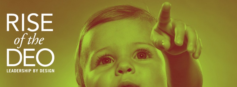 Rise of DEO is an inspiring book by Maria Giudice about leadership by design.
Meanwhile, my developer self wanted to understand how the blockchain worked. I loved the practicality, speed and scale that came with software development. The simple recipe of making a website from scratch. The instant gratification of pushing code online. Having reach to 3 billion people on the Internet with one commit. With all this combined, the relative impact of programming was immeasurable.
Here is a secret I learned: You can design technologies and use coding as your superpower. As design and engineering communicates better, your team moves faster, you iterate more, and land creative as well as feasible solutions. So, I started as a software engineer ‘with an eye for design’. Then I took on hybrid roles that combined front-end development and design. Currently, I am a designer who can think like a programmer.
How can designers THINK in Code?
If you are a UX designer, developers will implement your designs in code one day. Your mocks will become parts of programs that reach real users. One thing that helps with this process is thinking in code. That is putting yourselves in the shoes of the developer. Here are two practical ways you can adopt the superpower to think and talk like a developer.
Prototype: Visual Programming
Another way to empathize with developers is to use visual programming for prototyping.
 Origami, one of the best visual programming tools for designers.
What is visual programming?
I am a visual thinker, that means the majority of my ideas come in the form of pictures. When a concept gets complex, I reach for the white board to draw it out, to explain it to myself and to others. Similarly, visual programming illustrates how components of a process relate to each other. An easy example that everyone is familiar with is a flow chart. In contrast, text-based programming flows line-by-line. Like the command-line tool; the green and black interface of the Matrix.
Why use visual programming to prototype?
If you are a visual thinker, like many UX designers tend to be, visual programming will come to you naturally. Also, using these tools, you will build an understanding of how each button and screen relate to each other.You will understand what components make up the big picture and how logic flows through the prototype. So this is a great way to build empathy with developers, who live and breath in Number Land.
 This is why we call Origami Noodle Soup
On my design team, our go to prototyping tool is Origami Studio, also known as Noodle-soup. There are practical reasons why we prefer this tool. First, you can copy paste designs from Sketch and preview on a device using the iOS app. Second, a vast library of patches is available, including option switches and built-in animations.
Looking to get engineering or stakeholder buy-in? Powered with Origami and similar tools, possibilities of what you can prototype are endless. You can explore a wild range of ideas from building a voice recording tool to a native camera app in a few minutes. Go out to the wild, build your crazy idea, and illustrate how innovative your concept is! If your design fails while you try to put it in numbers and patches, let it evolve or pivot to another.
“If a picture is worth 1000 words, a prototype is worth 1000 meetings.” — saying @IDEO
What is an edge case?
In the development of a software program, engineers first consider a general case: the average scenario that is most likely to happen. Afterward, they consider the edge cases: boundary conditions that are less likely to happen.But if they don’t take care these, the program can crash and burn.
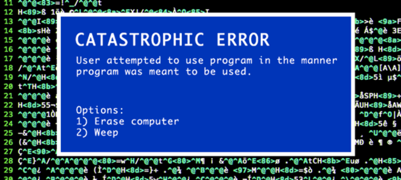 Here is a catastrophic error when user hit an edge case. Source
What I mean by designing for the edge cases is a fancy way of saying: Think of all your users .You can design the edge cases by debugging with extreme usersand localizing not just for languges also for cultures.
Debug with Extreme Users
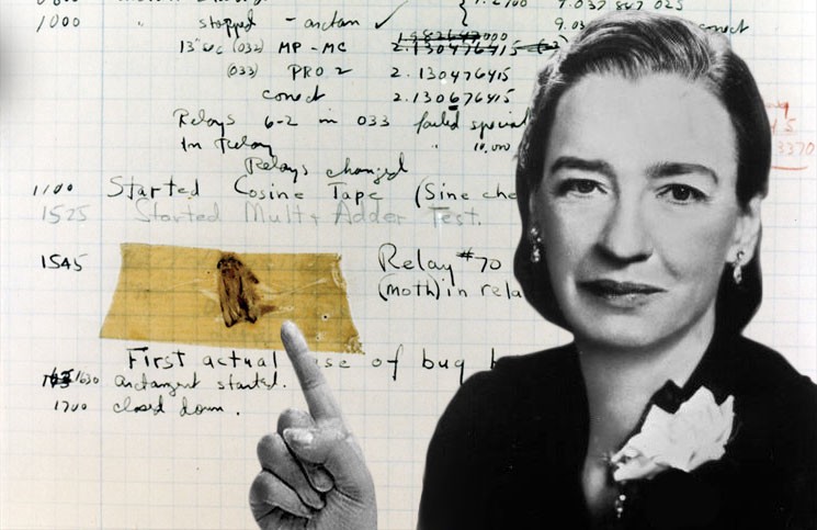 Grace Hopper found the first bug ever! Source
Software applications can encounter either software errors or hardware errors. A bug is the issue in the code that is causing that error. Grace Hopper, one of the first female programmers, recorded the first software bug. She found a moth in one of the components of Mark II. Who knows what the moth was doing there, but bugs came to take the blame for software errors since then.
A great way to debug issues considering your designs is examining the extreme users. People who fall off the wagon too early. And those who use the wagon so often that they want the wagon to fly and to become a submarine overnight! Formally, extremes are either the rejectors, who uninstall your app or churn really quickly, or the power users, who use your product day and night. Extremes are important, as they help you identify the pain points. For example, my team holds weekly office hours to stay in contact with our users. Our power users can ask us questions over a messaging platform. Usually one person from our support team and one from the product team join these conversations.
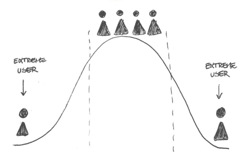 Rejectors < Most Users > Power Users. Source
Localization: Know your audience
Localization in software is the translation and adaptation of a program. While traditional translation takes place after the source document is final, in software localization runs in parallel with the development. This way the feature can ship in all language versions. As a designer, considering your users should include thinking about internationalization. Here are some questions to ask yourself to design for localization:
Most basic question: what language do you design in?
We design in English, since it’s the common ground that is familiar to everyone on the team. This particular example I have is for button text. One challenge with the phrase “Go live” is that this button reads both go ‘lɪv’ and ‘laɪv’. Since ‘what’s happening right now’ is core to Twitter, we decided that all capital LIVE reads laɪv. Besides capitalizing the word, we often use it in a rectangular red badge, encapsulating it like the live sign on TV.
What translations do you include in your designs?
 Bringing translations in your mocks can make a HUGE difference
Additionally, it is important for us to design for some of our biggest markets.An easy way of doing this is placing translated strings in our mocks. For example, continuing on the button text example, some of our largest markets are in Turkey and Russia. “Canlı Yayın Başlat” and “начать трансляцию в прямом эфире” are much longer in context as you can see.
Is your imagery culturally universal?
Another way to consider different markets is understanding cultural connotations. For instance, Twitter uses a Quill for the Tweet compose icon.
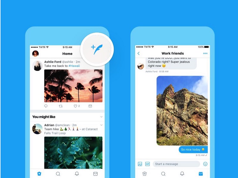 Twitter uses a Quill for the Tweet compose icon.
Tweet compose is arguably the most important action on the platform. Yet the Western idea of a quill as a writing tool doesn’t play out on the East. In Japan, one of our fastest growing markets, they never had quills but just brushes. Research showed that too many people in Japan tried tapping it to update their timeline, because it looked like a refresh button. We eventually landed on a single word instead of an icon: Tweet. Tweet is a word that Twitter invented. And Tweet is universal to all Twitter users.
Consider Technical Constraints
Another superpower we can bring into our process is designing with the engineering constraints.
In the world of static mocks and flawless prototypes, software bugs and considerations are invisible. They play hide and seek. If you as the designer don’t find them, your users sure will. When design considers developmental limits, constraints won’t get in the way of design. In contrast, when UX is designed around technical limitations, constraints become your strength.
Nomatter how good your engineers are, the application you are building will not feel the same between two devices. Internet speed, data usage, and device bandwidth are all technical limitations that result in distinct experiences.
Network speed (3G, LTE etc) across the world and network quality across your living room may vary. In addition, each device will have different bandwidth, which will affect the throughput: Bandwidth refers to the data rate supported by a network connection; the overall capacity. Throughput, is the amount of data that can flow through the connection.
Imagine the network connection as a pipe. Differences in network quality are like occasional leaking. The pipe’s size is bandwidth. Throughput is how much water can run through the pipe. Remember that your application is only one of the sources of water.
You will design realistically, when you bring the imperfect pipe into your process. Try adding loading states to your mocks and stalls in your prototypes. It won’t look pretty! But it will help you understand how your app feels on different people’s hands.

I used to believe thinking in code while designing restricts creativity. I wanted my designs to be unprecedented. I knew that conciseness and reusability in programming was important. But I did not see the link between unique designs and the systematic way of code and logic.
I discover that the more I bring my programming knowledge into my design practice, I am able to move faster and iterate more throughout the process. Through the engineer-designer feedback loop, designing for edge cases, and considering the technical constraints, I grow as a designer.
All the UX designers out there, you can design technologies and use coding as your superpower.
Asli is a designer, programmer and yogi. She earned a Computer Science and an Architectural Design degree from Stanford. She is responsible for conceptualizing, prototyping and building software experiences at Twitter across interaction, UX, visual, and motion design. She is passionate about bridging the gap between software and design processes. While she is not working, writing or speaking, she mentors startups and students. She is currently training to be a yoga teacher.


